Mission CliQ-Possible
Gamified Shopping experience re-imagined in a 48-hour challenge of Customer Value and the bounce barrier.

Introduction
In this project, I have introduced a new feature in the Tata CLiQ app which aims to positively impact the business by improving Customer Lifetime Value and Sales reducing Bounce rate within the timeline of 48 hours. I did this project under the guidance of my mentor Anudeep Ayyagari.
I bid you a warm welcome to my 48-Hour Product Challenge case study. These 48 hours were completely crazy each participant was assigned an individual problem statement and given just 48 hours to develop a minimum viable product (MVP) solution.

Problem Statement
Trying to incorporate gamification by adding challenges in the Tata CLiQ app to make the product design better, currently, the app lacks that feature.
Core Idea of the feature
- This feature will introduce challenges for users to complete while shopping on the platform.
- These challenges can include completing a certain number of purchases within a timeframe or spending a certain amount of money to unlock rewards or discounts. User can track their progress and compete with other users on leaderboards to earn badges, trophies, and other incentives.
Business Metrics Targeted
- Customer Lifetime Value: By incentivizing users to complete challenges and earn rewards, they may be more likely to return they may be more likely to keep returning back into the platform and make future purchases, increasing their CLV.
- Bounce Rate: Introducing gamification elements like challenges, rewards, and leaderboards can make the shopping experience more engaging, and encourage users to stay on the website longer. This can potentially lower the bounce rate, as users are more likely to explore the website, discover new products, and make a purchase.
Constraints:
The gamified shopping experience should not disrupt the overall shopping experience or make it difficult for users to navigate the platform. The challenges should be achievable and not overly complicated or time-consuming.

Presenting the Final Solution
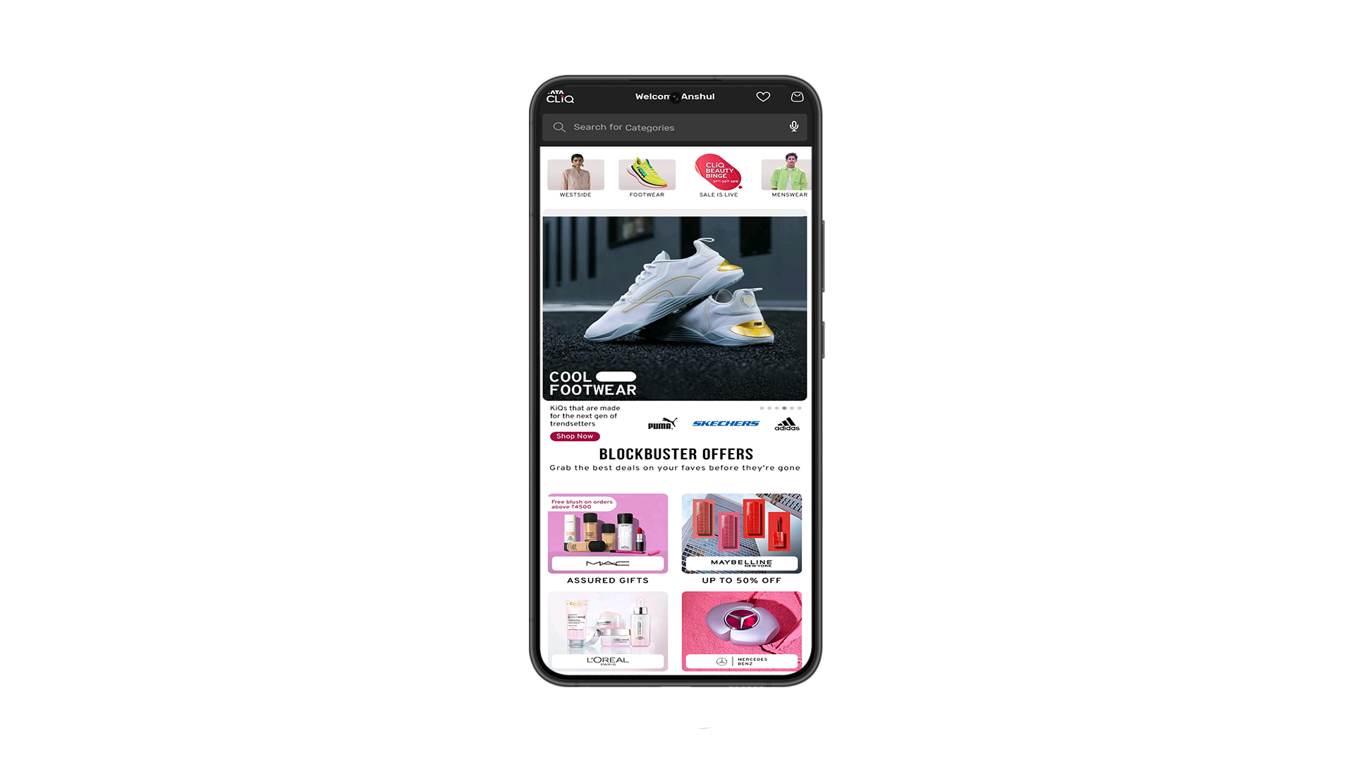
So there is no gamification in the Tata CLiQ app at the moment, so I decided to add challenges to the app as shopping gamification is one of the primary motivators driving shopping engagement and indirectly impacting consumers' intention to buy using a mobile app.
This can catch the eye of the users who were just browsing through the app, this can reduce the bounce rate as its incentivizing the users to make a purchase.
I decided to add challenges in the app on the second fold of the screen, so this can catch the attention of the users and also this would not disrupt the overall shopping experience.
Now let us go ahead and let me show you what decisions I took in this project to reach the solution.
Critical Decision 1 - Selecting the apt idea to go forward with
After considering a few other iterations, I made the decision to implement a challenge-based incentive system in the gamified shopping experience for the Tata CLiQ app. This particular design was chosen due to its potential to incentivize both existing and new users while also addressing the high bounce rate issue. By introducing challenges and rewards, users are engaged in a more interactive and enjoyable shopping experience, leading to increased user retention and decreased bounce rate.
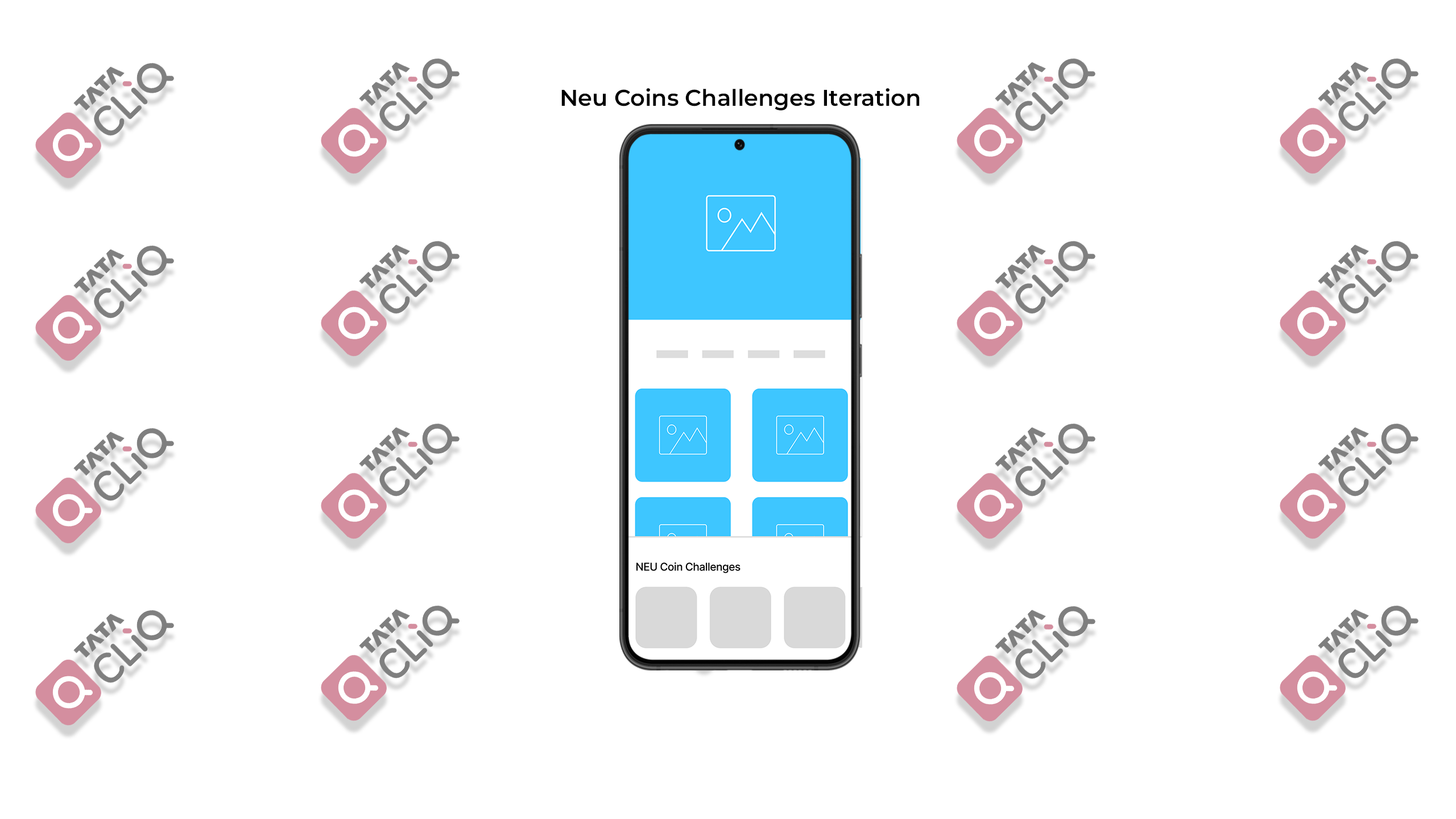
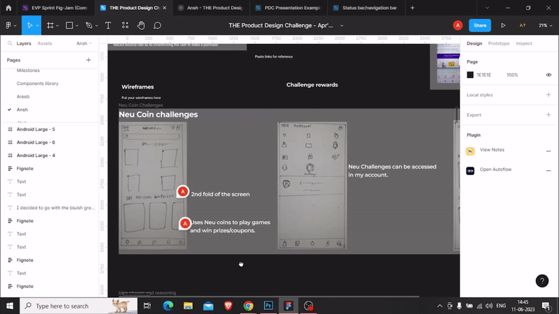
Neu Coins Challenge
NeuCoins are the rewards a customer earns when transacting on the Tata Neu app, website, or at any brand stores or hotels. So in this, the user would be able to select coupons or participate in challenges by using the Neu coins.
The reason why I didn't go ahead with this particular idea is that new users won't be able to take part in the challenges as they won't be having in-store credits to use.

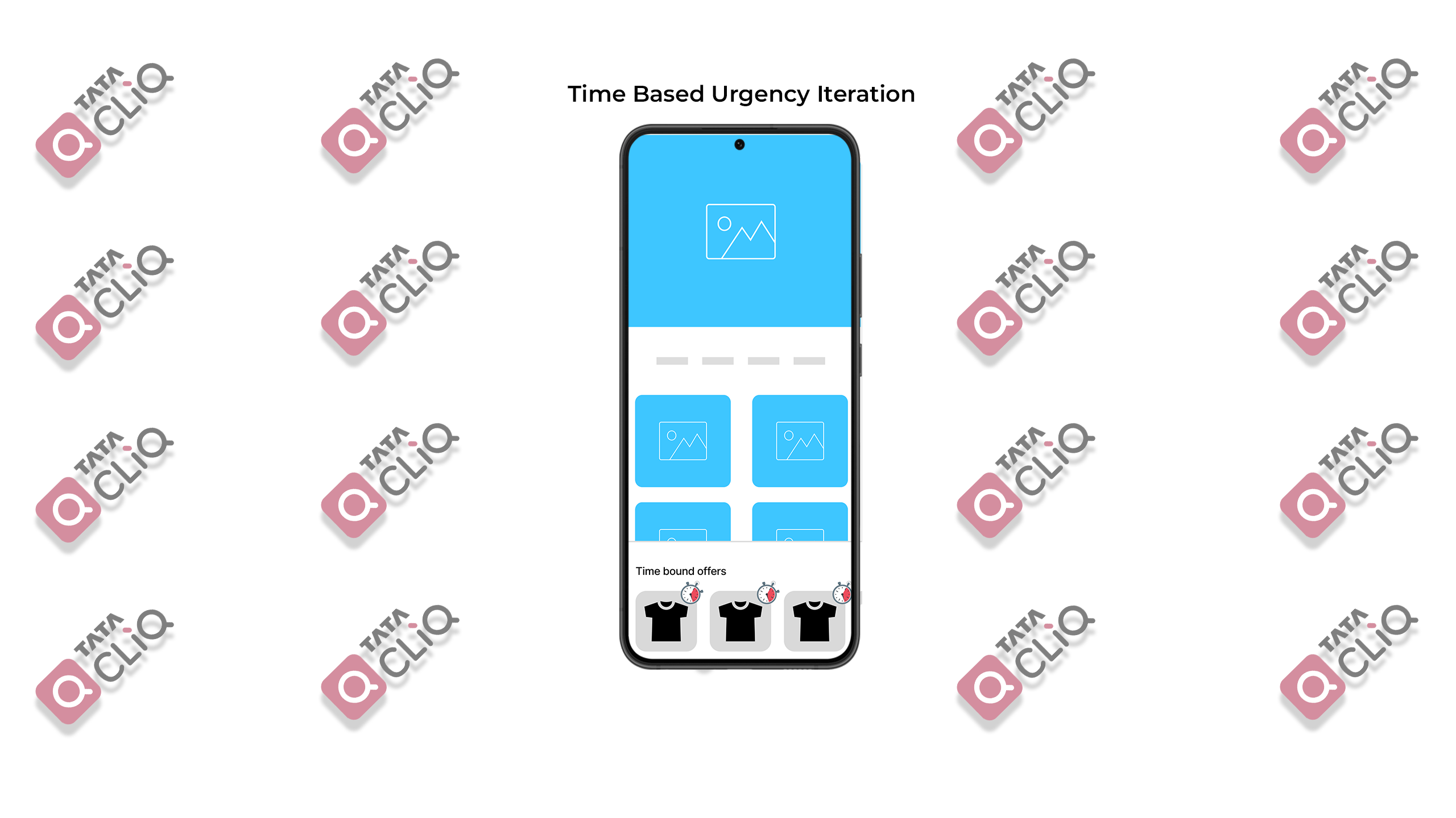
Time-Based Urgency
In this idea, I thought about implementing a time-based challenge for the users. Gamification elements like countdown timers or limited-time challenges could motivate users to make a purchase before time runs out.
The reason why I didn't go ahead with this idea is because I don't think it would attract the target demographic that is the GenZ and millennials much.

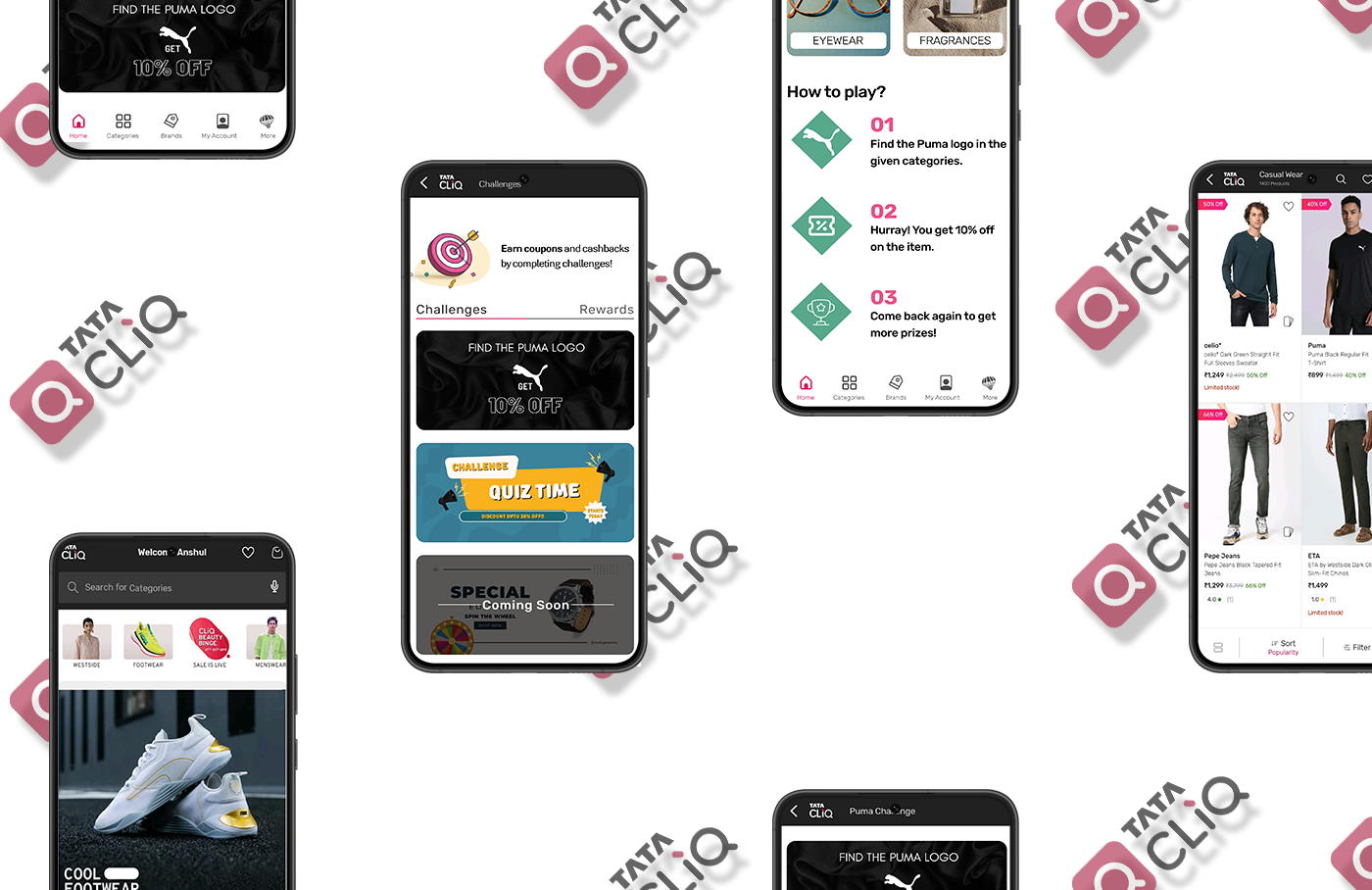
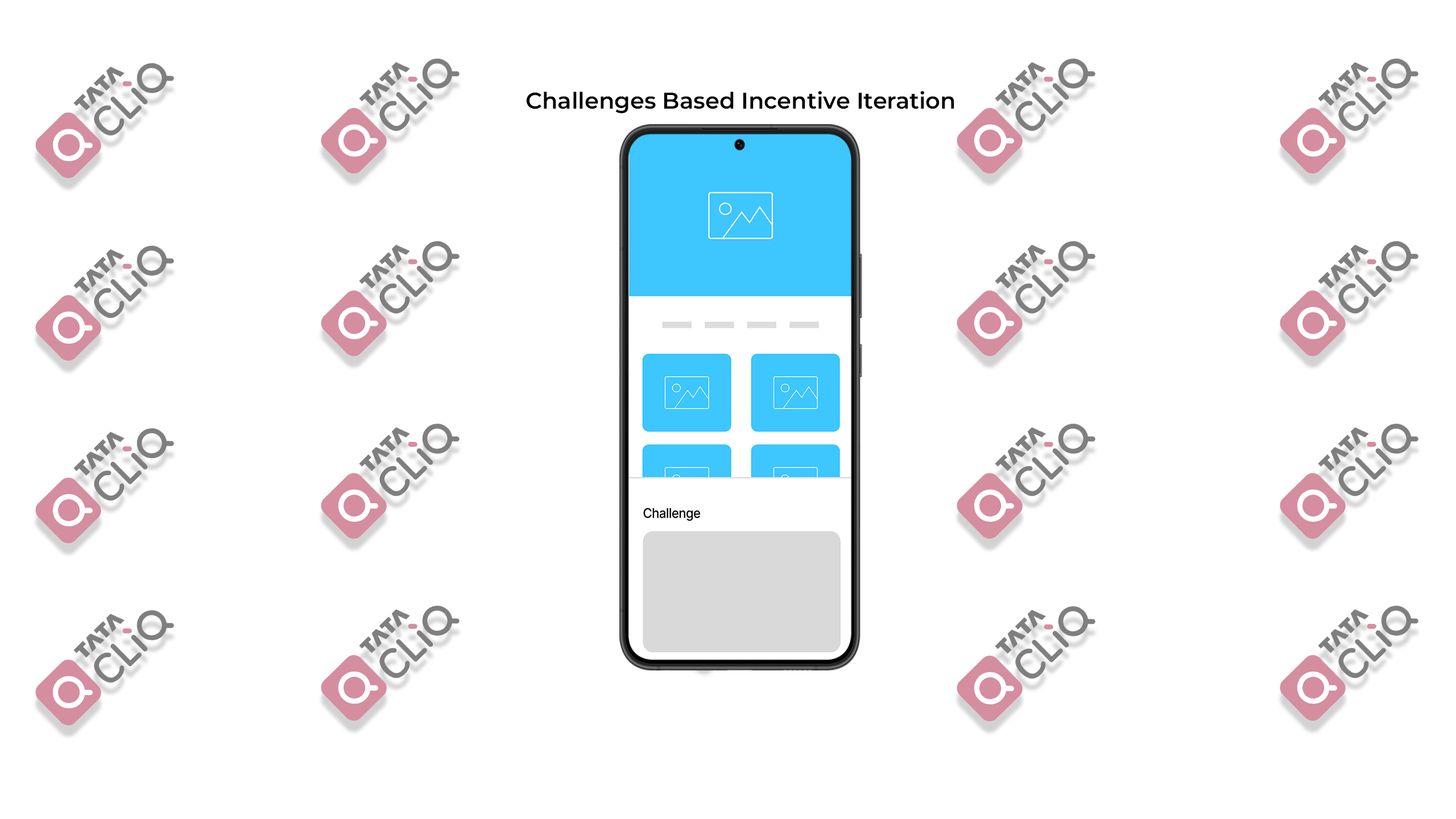
Challenges Based Incentive
In this iteration the users would have to compete in certain tasks like 'Spin the wheel', 'Festive Quiz', ' Find coupons', etc to get immediate coupons after completion of the task.
This would gamify the experience for the users which incentivizes them to make the purchase. I decided to go ahead with this iteration because this would help the business as well as the users.

Second Critical Decision — Proper explanation of current challenges
After conducting user testing, I discovered that users were facing difficulty in understanding the requirements to complete the challenges in the app. Merely relying on the banner alone proved insufficient for providing clear instructions.

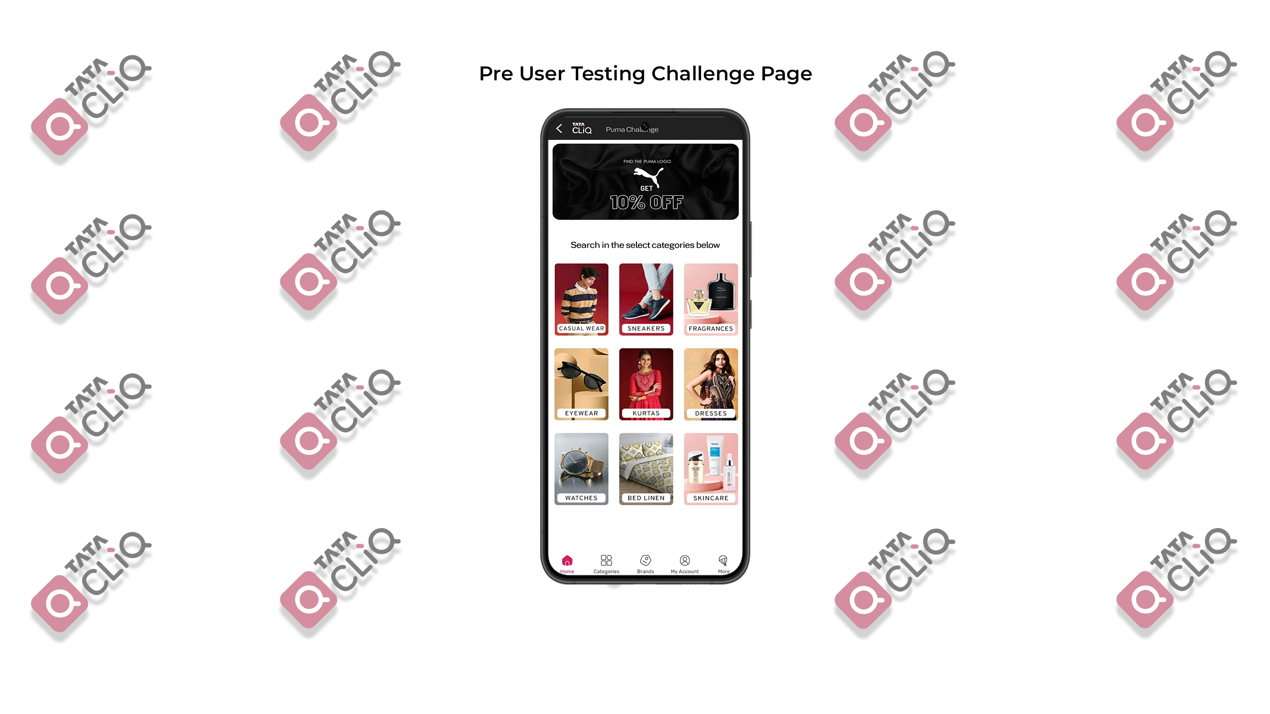
To address this issue and enhance the overall user experience (UX), I made the decision to include a “How to Play” section within the challenge page. By incorporating this additional feature, users now have access to explicit instructions and guidance on how to successfully complete the challenges. This improvement aims to eliminate confusion and ensure that users fully comprehend the tasks at hand, resulting in a more engaging and user-friendly gamified shopping experience.
I also reduced the number of categories for the users to choose from as I observed in the Usability Testing that they were feeling overwhelmed after seeing the number of categories before them. I narrowed it down to four categories that the brand makes products for.
Also, added a challenge tracker on top of the screen so that users can see that they completed the challenge and come back again the next day to participate again. This can increase the Customer Lifetime value as it incentivizes the user to keep coming back to the app.
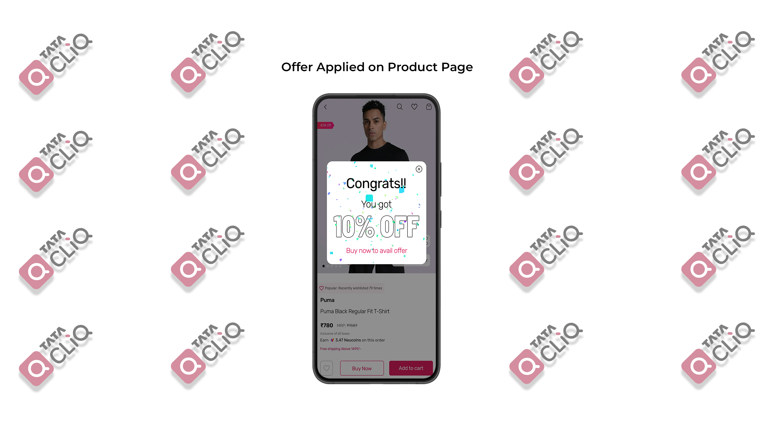
Critical Decision 3 - Levying the discount of certain challenges in the product itself
Based on the insights gained from usability testing, I made the decision to incorporate a direct discount on the product itself in certain 'Challenges', rather than providing users with a separate coupon to redeem on the current challenge page. This decision was motivated by the observation that users were not satisfied with navigating to the rewards section.

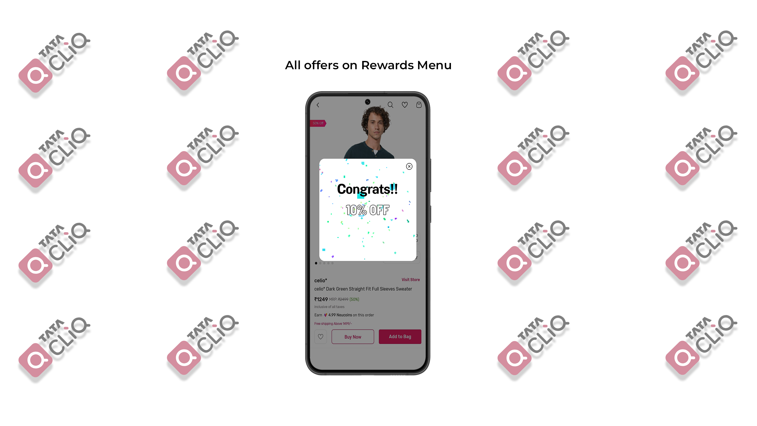
By displaying the discount visibly on the product page immediately after the user completes a challenge, I anticipate a positive impact on user experience (UX) and a potential reduction in bounce rate. This approach leverages the principle of immediate gratification, as users are incentivized to make a purchase when they see the discount applied directly to the product they are interested in. This seamless integration of incentives during the purchasing flow aims to enhance user satisfaction and encourage conversion.
Well the short and sweet version of the case study ends here Sailor you can view the assets used in the project below, if you would like to know more about the project scroll down.


Secondary Research
Tata CLiQ, headquartered in Mumbai, India, is a prominent Indian e-commerce enterprise. It falls under the ownership of Tata Unistore Limited, a part of the esteemed Tata Group. Tata CLiQ specializes in diverse product categories, including Fashion, Footwear, and Accessories. Going beyond its existing offerings, the Tata Group's E-commerce platform has also introduced Tata CLiQ Luxury, an exclusive destination for premium and luxury fashion as well as lifestyle products. Within Tata CLiQ Luxury, you will find an extensive assortment of exquisite apparel and accessories catering to both men and women, carefully curated by renowned luxury and bridge-to-luxury brands.
Competitor Research:
There are many competitors in the e-commerce sector but for the scope of this project, I decided to focus on Ajio and Flipkart as both of them had different types of gamified challenges present in their products.
User Behavior and Use Cases:
Competitiveness: Users who are competitive by nature may be motivated to complete challenges and earn rewards to beat their friends or climb the leaderboard.
Incentivizing purchases: Users who are on the fence about making a purchase may be more likely to do so if they know they can earn rewards or discounts by reaching a certain spending threshold.
Repeat purchases: Users who enjoy the gamification elements and rewards may be more likely to return to the platform and make future purchases, increasing their customer lifetime value.
Exploring new products: Users may be more likely to explore new products and categories on the platform in order to complete challenges or earn rewards.
Time-sensitive purchases: Gamification elements like countdown timers or limited-time challenges could motivate users to make a purchase before time runs out.
Social sharing: Users may be more likely to share their shopping experience on social media if there are unique challenges or rewards involved, leading to increased brand awareness and user acquisition.
Product discovery: Gen Z and Millennials are more open to trying new products and brands. Gamification challenges that encourage users to explore new products and categories could help drive discovery and product adoption.
Ideation:
After going through research and use cases I decided to go forward with ideation.
What better way to ideate than using pen and paper to give your thoughts shape?
User Flow of the Solution:
1. User opens up the app
2. Scrolls down and sees the ongoing challenges
3. Taps on the challenges and goes through how to complete them.
4. Completes the challenge and gets an instant offer on the product or receives a coupon.
5. If receives a coupon then the user goes to my account and selects challenges.
6. Users can view ongoing challenges in the app and view the rewards they have earned.
Insights Garnered from usability testing:
After making the UI based on my assumptions and secondary research below are the insights I received after testing with 4 users:
1. The visibility of the challenge on the home page was not conveying what it was for to the user.
2. The users were not able to understand what the challenge was about by just the banner.
3. User was confused after seeing 9 categories for a challenge.
4. The challenges and the reward section tab was discoverable by the users.
5. User had difficulty noticing the upcoming challenges tab.
Future Scope:
The feature can be expanded upon by adding further gamification elements like "Levels", as the user keep on participating and completing the challenges they would be eligible for better prizes and offers this can further improve the Customer Lifetime Value.
And thats a wrap folks, thankyou for going through my case study, if you have any feedback or you would like to connect with me then contact me on :
LinkedIn : Anshul Chowdhury
Email : anshul672@gmail.com
Portfolio